Creating Spiritual Content: How to Design Visuals for Spirituality Blogs
Learn to source authentic spiritual imagery, master chakra color psychology, and avoid stock photo pitfalls. Design visuals that match your mindfulness blog’s energy.
Table Of Contents
We live in a culture that is utterly exhausted, so it makes sense that people are constantly searching for quiet spaces online. Mindfulness guides, chakra explainers, and meditation techniques have moved from obscure corner shops straight into mainstream web feeds. If you write for this crowd, you already know that translating spiritual concepts into written words is hard enough. Translating them into images is another struggle entirely.
Most people read with their eyes first, literally. Web data from HubSpot shows that human brains process visuals rapidly, and posts containing imagery get vastly more eyes on them than plain blocks of text. The problem is that standard stock imagery looks incredibly fake. A corporate model sitting in a perfect lotus position with a forced smile does not communicate inner peace. It communicates a sales pitch. You need images that carry actual weight and match the energy of the spiritual lessons you share.
This becomes a massive hurdle when you do not have the budget to hire a professional photographer for custom shoots every single week. You cannot simply steal low-resolution graphics off search engines either, because that ruins your site authority instantly. Instead of overthinking it, you can curate high-quality stock files from professional resources, but you have to filter your searches with a critical eye. Sourcing visual assets from a massive database like DepositPhotos gives you access to high-resolution, professional photos of real yoga practitioners, raw nature, and subtle energy art, provided you look past the overly polished first page of results. The goal is to hunt down photos that feel intimate, not mass-produced.
The Energetic Vibration of Color Choice
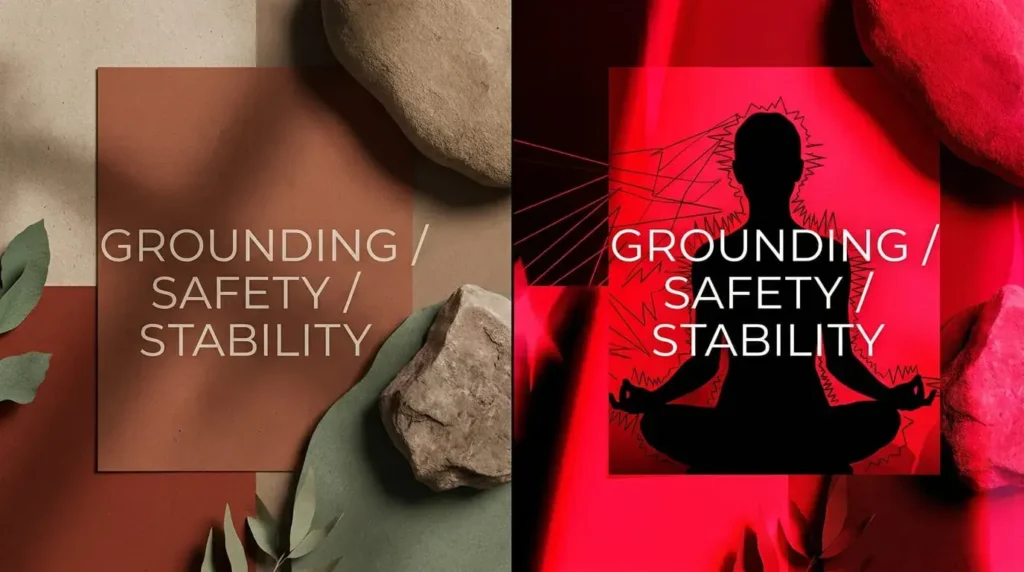
When someone lands on your page to read about root chakra healing, their nervous system should settle down before they read a single word. That is how visual energy works. If you pair a soothing article about grounding with a jarring, neon-red graphic or cold, synthetic colors, you create a subconscious clash. The reader feels a mismatch, even if they cannot put their finger on why.
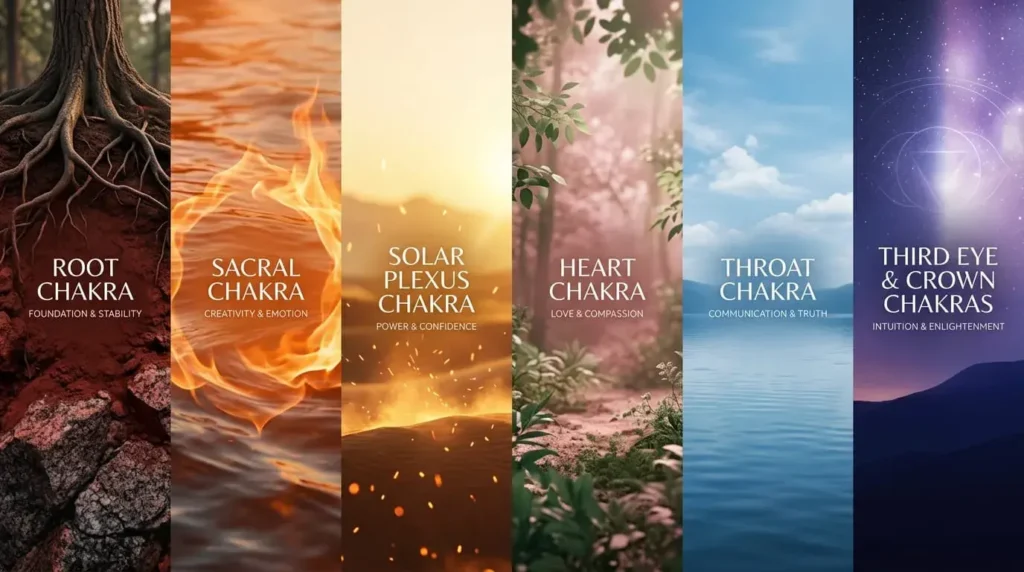
Every energy center has a specific visual language. Aligning your graphics with these frequencies creates a much smoother reading experience.
- Root chakra: Grounding tones. Rich clays, deep forest soils, and warm, dark reds. Look for textures that feel solid, like granite or ancient tree trunks.
- Sacral chakra: Warm, fluid oranges. Think of sunlight moving through water, crackling fire, or raw clay.
- Solar plexus chakra: Golden, empowering yellows. Look for soft morning light, desert sand, or glowing embers.
- Heart chakra: Deep botanical greens and soft, dusty rose tones. The images should feel spacious, like a clearing in a pine forest.
- Throat chakra: Airy sky blues and quiet lake surfaces. The mood should be still and spacious.
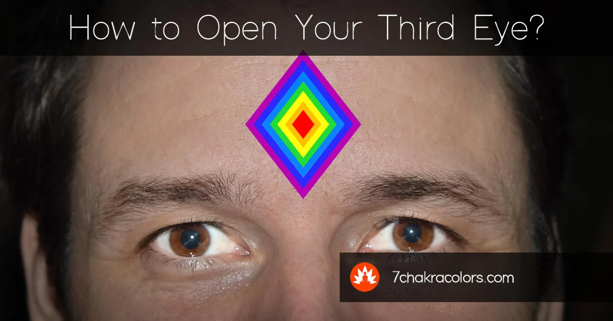
- Third eye chakra: Deep indigo and starry twilight scenes. Seek out soft focus and depth.
- Crown chakra: Violet, pure white, and soft light leaks.
How to Select Spiritual Imagery Without Looking Commercial
Most stock platforms are built for corporate businesses. They want bright, perfectly lit, ultra-sharp photos that scream for your attention. Spiritual and holistic content requires the exact opposite approach. You want images that feel quiet, organic, and gentle on the eyes.
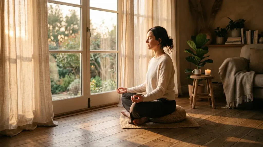
Look for Soft, Natural Lighting
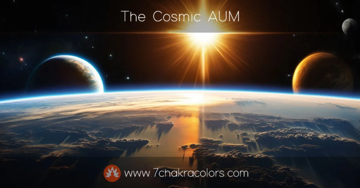
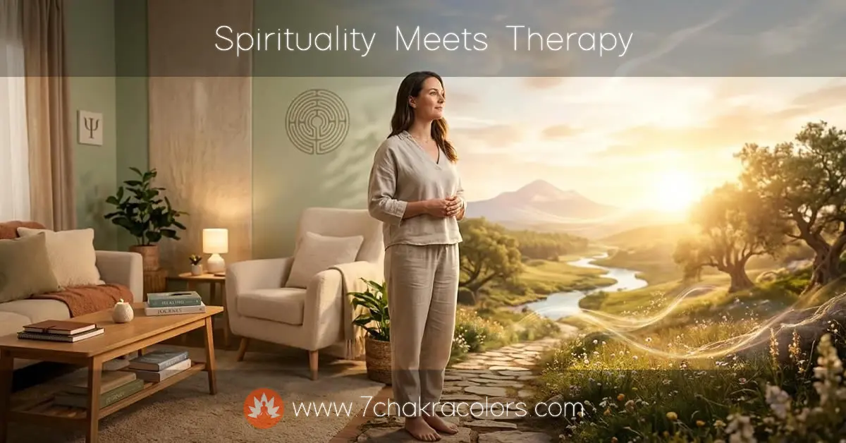
Harsh overhead studio lights strip away the mystery and warmth of spiritual practices. Look for images shot during the golden hour, which is the time right before sunset or after sunrise. Shadows are your friend here. Soft, diffused lighting through a window or light leaks across the lens give photos an ethereal, real-world quality that mimics quiet contemplation.
See Example:
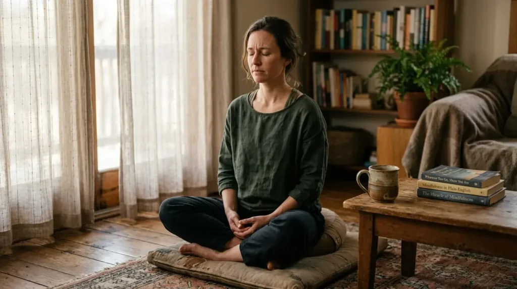
Prioritize Realistic Human Emotion
People can spot a staged photo in half a second. Instead of looking for models holding pristine yoga poses while grinning at the sky, look for raw, quiet moments. A close-up of worn hands holding a warm ceramic mug of tea. A meditation practitioner with their eyes closed, showing a subtle crease of concentration on their brow. These small, unpolished details make the reader feel like they are looking at a real human being rather than a corporate marketing campaign.
See Example:
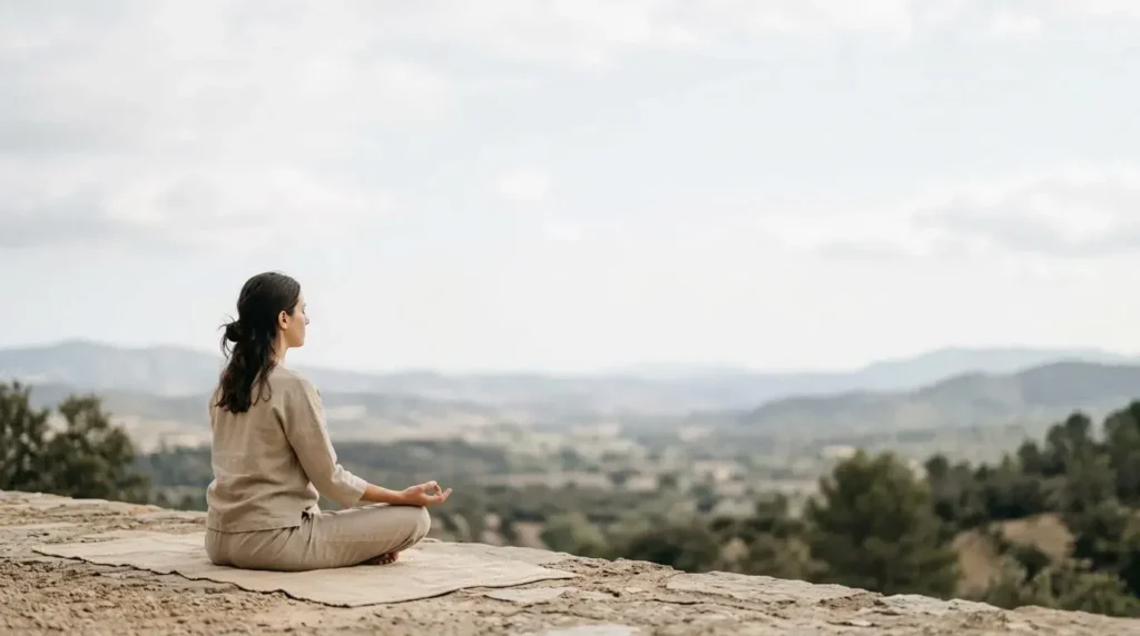
Embrace Negative Space
Don’t feel the need to fill every corner of your blog graphics with text, logos, or busy patterns. Spiritual themes require space to breathe. Choose images that have large areas of empty sky, simple walls, or soft-focus backgrounds. This negative space allows you to overlay a simple, clean title without making your Pinterest pin or header graphic look chaotic.
See Example:
Understanding Image Licensing and Copyright Protection
Here’s where most creators get nervous. You can’t just grab any image off the internet and stick it on your site. That’s how you land in copyright trouble – fast. The thing is, understanding licenses doesn’t have to be complicated.
Stock photo platforms operate on different licensing models. Some require attribution, some don’t. Some let you modify images, others forbid it. Check the license before you download anything. Most reputable platforms like Unsplash, Pexels, or DepositPhotos make this crystal clear. The license sits right next to the download button.
Creative Commons is worth understanding. CC0 means no attribution needed. You’re free to use it however you want. Other CC licenses have conditions – maybe you need to credit the photographer, maybe you can’t sell the image, maybe you can’t edit it. Always read the specific CC license attached to each photo.
Here’s the practical approach: stick with platforms that cater to content creators. They’ve already vetted the images. They handle the copyright protection. You download with confidence because the site guarantees you won’t get sued. That peace of mind is worth the subscription fee. Seriously.
Design Tools That Don’t Require Professional Skills
You don’t need Photoshop. You don’t need years of design training. Several tools let you create custom graphics in minutes – and they’re made specifically for people like you.
Canva has revolutionized blog graphics. It’s built for people who can barely draw a straight line. You drag templates, swap images, change colors, adjust text. Done. The spiritual content creators I know use Canva constantly. It’s fast, the templates work, and you can make something that actually looks intentional without technical skills.
Figma works if you want more control. It’s steeper learning curve, but creators who spend time with it swear by it. The collaboration features help if you’re working with a designer or managing multiple projects across a team.
Adobe Express is worth testing if you’re already in the Adobe ecosystem. Not as intuitive as Canva, but more powerful. The choice depends on your comfort level and how much customization you need.
What matters most isn’t which tool you pick. It’s consistency. Once you learn one, stick with it long enough to get fast. You’ll develop a style without thinking about it. Your graphics will look like they belong to your site because you’re using the same design decisions repeatedly.
Building a Strategic Image Library for Your Content
Most spiritual creators make this mistake: they grab images randomly, one article at a time. Suddenly six months in, their visual style is all over the place. Root chakra posts have different color palettes. The fonts clash. Nothing feels cohesive.
Instead, build a library. Before you write your next dozen articles, spend an afternoon on stock sites collecting images that match your vision. Download them. Organize them by chakra, by mood, by color family. Create a folder system. When you sit down to write, the images are already waiting. You’re choosing from what you’ve pre-vetted.
This saves time, but more importantly – it keeps your visual brand tight. Your readers start associating certain color palettes with your content. They recognize your posts in a feed before they read the headline. That’s the power of consistent imagery.
Use a spreadsheet or Notion database. Track where each image came from, the license terms, the color palette. Include the photographer’s name if attribution is required. Seriously – keep records. Three months from now you won’t remember if that sunset photo was free-to-use or needed a credit. Documentation saves you headaches.
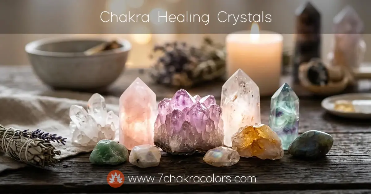
Color Psychology Meets Spiritual Energy
Colors don’t just look pretty. They affect how people feel. This isn’t woo-woo. Neuroscience backs it up. Certain wavelengths of light trigger actual physiological responses. Your nervous system reacts before your brain even registers what you’re looking at.
When you’re pairing images with articles about spiritual healing, you’re working with two layers of meaning. The chakra colors matter. But so does the psychology of the actual colors in your photographs. A vibrant, saturated red stimulates differently than a muted burgundy. The same chakra, completely different energy.
Root chakra articles paired with deep terra cotta and natural brown tones feel grounding. Pair the same article with a bright, neon red and suddenly it feels aggressive. Your readers sense the difference. They might not know why they feel anxious instead of safe, but their nervous system clocked it.
See Example:
This is actually where your intuition comes in. Look at an image. Does it feel right for what you’re writing about? If something feels off, it probably is. Trust that instinct. Your subconscious picks up on these energetic qualities even when your conscious mind hasn’t named them yet.
Frequently Asked Questions About Spiritual Visual Content
Can I edit stock photos, or do I need to use them as-is?
Check your license. Most Creative Commons and stock photo licenses allow basic edits – cropping, brightness adjustments, light color changes. Full transformations where you’re basically creating new artwork from the photo get murky legally. If you’re doing heavy edits, buying extended licenses gives you protection. Some platforms specifically sell commercial licenses that cover substantial modifications. It’s worth spending the extra few dollars for that clarity.
What’s the difference between royalty-free and rights-managed images?
Royalty-free means you pay once and use it however many times you want. No ongoing fees. Most spiritual bloggers use royalty-free. Rights-managed means you’re licensing for a specific use – maybe just one article, maybe one year, maybe limited distribution. Usually more expensive, usually more restrictive. For blog graphics, stick with royalty-free unless you have a specific commercial use case.
Should my spiritual blog images match my social media aesthetic?
Absolutely. Your brand is your brand across all platforms. If your Instagram has certain color palettes and moods, your blog should echo that. Your readers jump between platforms. Consistent visual language builds trust and recognition. You don’t need identical images everywhere – you need the same visual language. Same color families, same quality level, same general vibe.
How do I source images when I have almost zero budget?
Start with free platforms: Unsplash, Pexels, Pixabay. They’re genuinely high-quality. Limited selection compared to paid sites, but good enough to build a solid library. Use them while you’re starting out. As your blog grows and you can invest in premium subscriptions, upgrade. Most creators move to paid platforms eventually just because the selection is better and more specific to spiritual content.
Can I use AI-generated images for spiritual content?
This is complicated. AI-generated images aren’t inherently bad, but they often look generic and over-processed. Spiritual audiences tend to value authenticity above all else. AI art can read as soulless. That said, some AI tools produce genuinely beautiful imagery. If you go this route, disclose it. Your readers deserve to know. The trend right now is that audiences react negatively to unlabeled AI content. Transparency matters.
What file format should I use for web?
JPEG for photographs, PNG for graphics with transparency. Optimize your images before uploading – smaller file sizes mean faster page loads, which Google cares about. Use free tools like TinyPNG or ImageOptim. Compress without losing quality. This isn’t optional if you care about SEO. Page speed is a ranking factor.
How often should I update my images, and does it help with SEO?
Updating images occasionally helps. Google likes fresh content. But don’t change images just for the sake of it – that triggers the “fresh content manipulation” warning Google warns about. Change images when they genuinely improve the article. Replace blurry shots with better ones. Swap outdated photos for current ones. Make real improvements, not busywork. Your readers notice the difference between intentional updates and desperate attempts to seem current.