
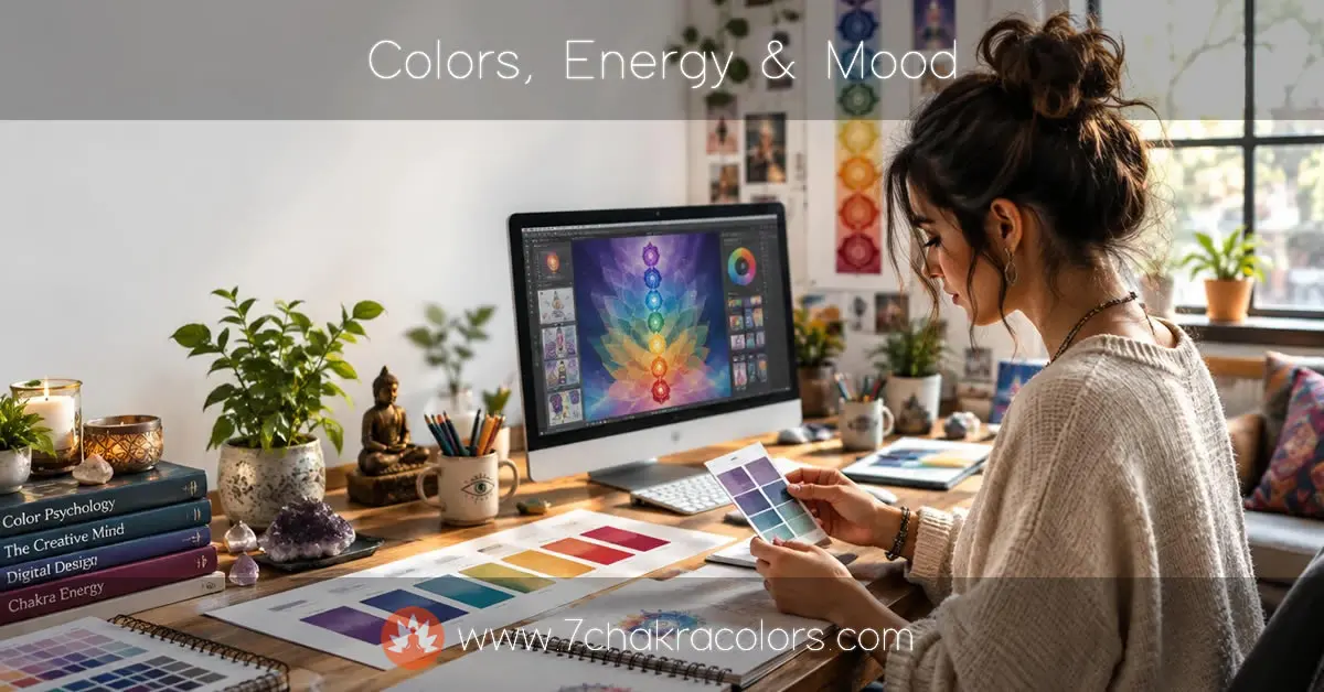
How Colors Affect Energy and Mood – And Why Color Knowledge Still Matters in the Age of AI
How colors affect energy and mood, what chakra colors reveal, and why color theory still matters when AI tools make brand design easy for anyone.
Table Of Contents
Most people can name their favorite color without thinking. Far fewer could tell you what the walls of their office are doing to them at four in the afternoon. That’s the odd thing about color – it’s one of the most constant influences on how we feel, and we hardly register it. It’s in the rooms we work in, on the packaging we pick up at the store, on the screens we stare into for (let’s be honest) far too many hours a day.
Colors affect your energy and mood whether you pay attention to them or not. Restaurants have known this for decades, which is why so few of them are painted cold grey. Clinics lean on soft blues and greens for reasons that have little to do with fashion. And brands will argue over a single shade of red longer than they argued over the company name. The chakra tradition got there much earlier, pairing each energy center with a color and a particular emotional quality. So in this article I want to look at how color actually works on us, how it ended up steering nearly every design decision on this website, and why knowing your colors still counts for a lot now that AI can generate almost any image you ask for.
How Color Shapes Your Energy and Mood Every Day
Take a quick inventory of where your days go. Kitchen, desk, car, the phone in your hand. Every one of those has a palette. Somebody picked it, or nobody did and it just happened – either way, it’s nudging you.
Reds, oranges and yellows usually push energy up. They read as active, urgent at times, which explains why clearance signs and fast food logos use them so shamelessly. Blue, green and violet work the other way; they slow the breath a little and make it easier to settle into a task. Neutrals are the quiet middle ground – somewhere for tired eyes to land.
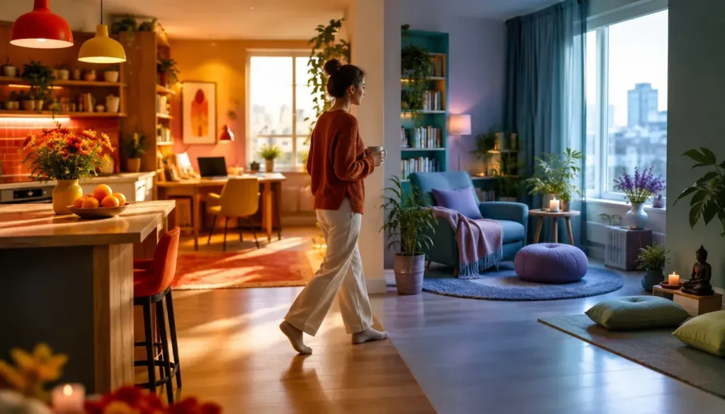
Light changes everything too. The same beige wall looks cozy under a warm bulb and almost clinical under a cold LED. So you’re never reacting to a color alone – it’s color, light and context together.
Designing This Website – Why Color Came First
When I started building 7 Chakra Colors, the name alone set the bar. A chakra colors site that looked dull or clashed would have undercut everything it was trying to say.
I’m a graphic designer by profession, so color was always going to be the thing I obsessed over first. And I did. In the early days every illustration, every chakra graphic, every header image on this site was made by hand. Sketching shapes, balancing gradients, nudging a violet by a few percent because it felt too cold sitting next to the indigo. Then doing it all again for the next chakra.
It was slow. Honestly, some weeks it felt endless. But I loved it, and that’s the part people outside design don’t always get – the tweaking isn’t a chore when it’s the work you enjoy. Getting seven strong colors to behave like one family, each clear on its own but none shouting over the others, took a lot of trial and error. It also taught me more about color than any textbook ever did.
From Skill to Ideas – What AI Changed for Creative Work
Back then, the gap between an idea and a finished image was skill. If you couldn’t draw, paint or push pixels around in Photoshop, your idea mostly stayed in your head. Or you paid someone who could.
That gap has almost closed. With today’s AI design tools, anyone can describe a scene and get a usable visual in seconds. A glowing heart chakra in soft green light. It’s on your screen before your coffee cools.
My first reaction was mixed, I’ll admit. Part of me felt a bit protective of the craft. But the bigger picture is hard to argue with – creative expression isn’t locked behind years of training anymore. You’re not limited by your skills. You’re limited by your ideas.
That’s a big shift.
Anyone Can Build a Brand Now – And Design Sits at the Center
The same thing has happened across the whole process of starting something. You can build a website without code, launch a small business from your laptop on a Sunday afternoon, or create a brand – name, logo, palette, product photos – without hiring an agency.
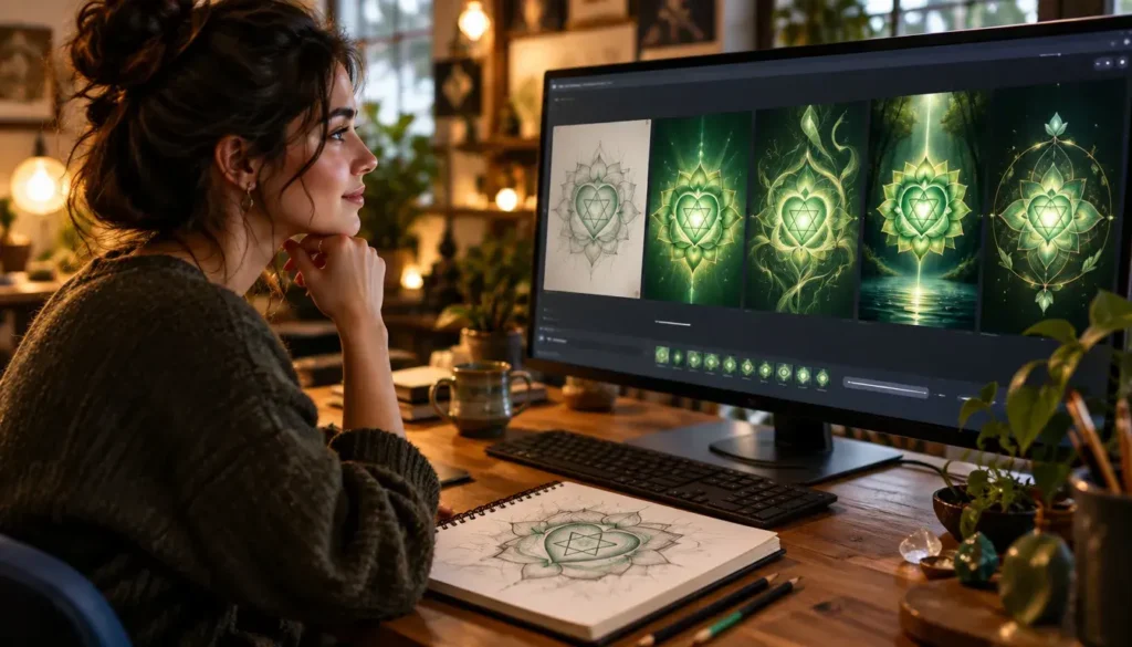
Design is still the glue, though. People size up a brand in a glance, and color is usually the first thing they register. So it pays to know what the current tools can actually do.
The AI Tools Behind Modern Brand Design
Most people building a brand today end up with some mix of these:
- AI image generators that create illustrations, backgrounds and product scenes from a text prompt
- Logo and brand kit tools that suggest marks, typefaces and matching color palettes
- AI photo editors for background removal, inpainting, relighting and upscaling
- Image-to-video tools that turn a still visual into a short motion clip for social media
- Palette generators that build a color scheme from one base color or a photo
Platforms like Pippit bundle several of these into a single creative workflow. Models like Seedance can enable creative teams to engage in more visual experimentation.
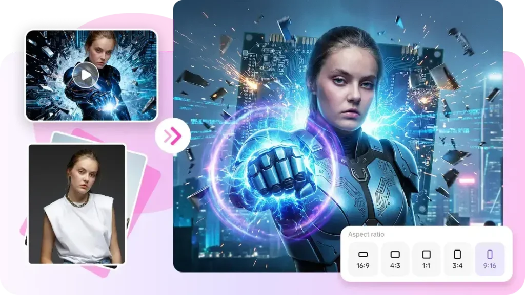
Getting Background Colors Right in Brand and Product Images
One place where AI really earns its keep is product and brand imagery – backgrounds especially. Background color decides how well a product stands out, how crisp its edges look, and how heavy or light it feels on the page. A warm backdrop adds energy and richness. Cool tones read as clean, fresh, calm or a little techy. Neutrals keep catalog shots balanced, and a dark background makes a premium product glow. Pick the wrong tone, though, and it clashes with the packaging, the logo or the text people need to read.
The trick is to prompt for relationships between colors, not just one color. Name a primary color, then the secondary and accent tones. Say whether the palette should be muted, balanced or vivid. Describe the brightness, the contrast between product and background, the gradient – and the lighting, which people skip all the time even though warm light turns a neutral surface golden and cool light turns it blue-grey. Mixing color instructions with scene details provides the AI background generator with more creative direction.
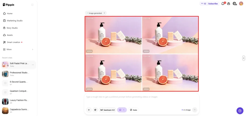
In a tool like Pippit, the process runs roughly like this:
- Add a reference image of your product, write a detailed prompt covering colors, tones, mood and lighting, choose an image model and hit generate.
- Compare the three or four drafts you get back and pick the one with the best color balance.
- Fine-tune it with inpainting, layer isolation, regeneration or upscaling, then download it as a JPG or PNG – or convert it into a short video.
Two habits make the biggest difference. First, use your brand colors as accents instead of flooding the whole background with them – a saturated brand-color backdrop tends to fight your logo rather than support it. Second, check the small stuff before you export – halos or color spill around the edges, shadows that quietly shift the colors, and enough clean space around headlines and calls to action. That last one is where a lot of AI images fall apart.
Skill vs AI – Where Creativity Actually Lives
So does all this make the designer obsolete? I don’t think so. It changes what the job is, though.
When I made artwork by hand, most of my hours went into execution. Now execution is cheap. What’s left – and what was always the valuable part – is judgment. Knowing which of those four drafts is the right one. Knowing why the second one feels off even though it’s technically fine.
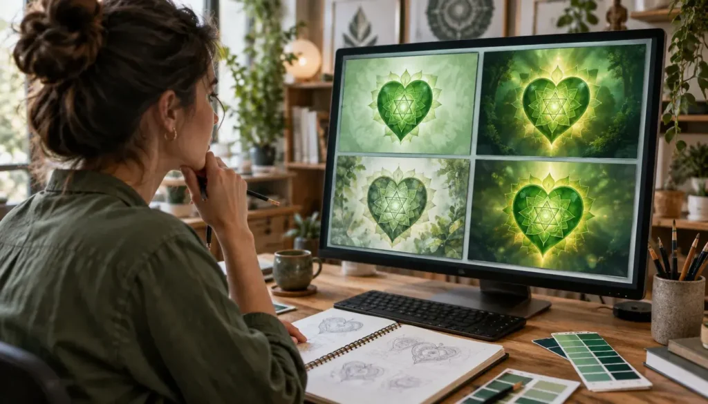
AI can hand you a hundred versions of a green heart chakra. It can’t tell you which green actually feels like the heart to the person looking at it. That still comes from you.
Chakra Colors – An Older Language for the Same Idea
Long before marketing teams ran A/B tests on button colors, the chakra system was already mapping color onto the body. Seven energy centers running up your spine, each tied to its own color. Red for the root chakra and grounding. Orange for the sacral chakra and creative flow. Yellow for the solar plexus and personal power. Green at the heart, blue at the throat, indigo at the third eye, and violet at the crown.
What I find fascinating is how closely this lines up with modern color psychology. Red wakes you up. Green calms you down. Blue helps you think and speak more clearly. Different vocabulary, same observation – color moves something in you.
| Color & Chakra | Effect on Energy and Mood | Common Brand Associations |
|---|---|---|
| Red – Root | Raises energy and alertness, feels grounding in small doses, urgent or aggressive in large ones | Passion, excitement, sales and clearance, food and fitness brands |
| Orange – Sacral | Warm, playful and sociable, sparks creativity and enthusiasm | Friendliness, affordability, creative and youthful brands |
| Yellow – Solar Plexus | Optimistic and bright, lifts confidence, can feel tiring if overused | Happiness, attention-grabbing signage, budget and family-friendly brands |
| Green – Heart | Balancing and restful, eases tension and feels natural | Health, growth, sustainability, organic and wellness brands |
| Blue – Throat | Calm, clear and focused, supports steady thinking and communication | Trust, reliability, finance, healthcare and tech brands |
| Indigo – Third Eye | Deep and introspective, invites reflection and quiet focus | Wisdom, depth, premium and professional services |
| Violet – Crown | Soothing and imaginative, feels spiritual and a little mysterious | Luxury, creativity, spirituality, beauty and wellness brands |
Color Theory – The Knowledge That Still Does the Heavy Lifting
Behind every palette that “just works” sits a whole body of knowledge called color theory. It covers which colors spark which emotions, which ones build trust, which combinations hold together, and how contrast affects what people can actually read. You don’t need a design degree to use it.
Start with emotion. Every color carries associations – some physical, some cultural, some deeply personal. Here’s how the seven chakra colors tend to line up with mood and branding:
Trust is a topic of its own. Blue shows up again and again in banking, insurance, healthcare and tech because it reads as stable and dependable. Green signals growth, health and sustainability. Bright red grabs attention fast but tips into urgency or aggression if you overdo it. None of this is carved in stone – culture shifts meaning a lot. White stands for purity across much of the West and for mourning in parts of East Asia.
Then there’s harmony, meaning which colors actually belong together. The color wheel gives you a few reliable starting points:
- Complementary – colors opposite each other, like blue and orange, for high energy and strong contrast
- Analogous – neighbors on the wheel, like green, teal and blue, for a calm and cohesive feel
- Triadic – three evenly spaced colors, lively but balanced as long as one leads
- Monochromatic – one hue in different shades and tints, clean and easy to control
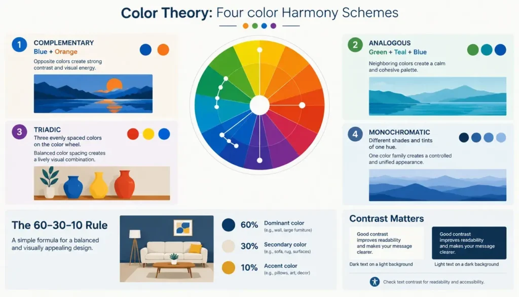
A lot of designers also lean on the 60-30-10 rule: one dominant color across roughly 60% of the space, a secondary color for 30%, and an accent for the last 10%. Contrast matters more than most people expect, too. Light text needs a dark field, dark text needs a light one, and anything people have to read should pass basic accessibility contrast checks. Seven bold colors is a risky starting point for any design, and that’s exactly the problem I had to solve here – the answer was to let each chakra color work as an accent inside a calmer, mostly neutral layout, so the colors could speak without yelling at each other.
Conclusion – The Tools Are Easy, Knowing How to Use Them Isn’t
We’ve never had it this easy. You can generate a brand’s worth of visuals in an afternoon and put a website together over a weekend. That’s genuinely exciting, and I’d encourage anyone with an idea to use these tools.
But the tools don’t know what your colors should say. They don’t know that a too-bright red makes a calming brand feel anxious, or that a throat chakra graphic needs a slightly softer blue to feel open rather than cold. You do – or you can learn to.
So learn the colors. Notice how they shift your own energy and mood through a normal day. Pick up a bit of color theory. Then let the AI tools do the heavy lifting on production. The software makes things now. Knowing how to use color – that part is still yours.
Frequently Asked Questions About How Colors Affect Energy and Mood
How do colors affect your mood and energy?
Colors act on you mostly below conscious awareness. Warm colors like red, orange and yellow tend to lift energy and feel active, sometimes urgent. Cool colors like blue, green and violet slow things down and make it easier to focus or relax. Neutrals give your eyes a place to rest. Light and context change the effect too – the same wall color feels cozy under a warm bulb and cold under a harsh LED. So pay attention to the whole setting, not just a single color.
What are the seven chakra colors and what do they mean?
Each chakra is linked to one color. Red belongs to the root chakra and grounding. Orange is the sacral chakra and creative flow. Yellow sits at the solar plexus and relates to confidence and willpower. Green is the heart chakra and balance. Blue is the throat chakra and communication. Indigo belongs to the third eye and intuition, and violet to the crown chakra and spiritual connection. Many of these meanings line up closely with modern color psychology.
Which color builds the most trust in branding?
Blue is the classic trust color. It reads as calm, stable and dependable, which is why you see it so often in banking, insurance, healthcare and tech. Green signals health and growth and works well for wellness and eco brands. That said, no color builds trust on its own. Consistency, readable contrast and a palette that fits what you actually offer matter just as much as the hue you pick.
Can AI design tools replace a graphic designer?
Not really. AI tools make execution fast and cheap – you can generate backgrounds, illustrations and product scenes in seconds. What they don’t give you is judgment. Choosing the right draft, spotting why a color feels off, keeping a brand consistent across dozens of images – that still takes someone who understands design and color. The best results come from people who know the craft and use AI to speed it up.
How do I choose a color palette for my brand?
Start with the feeling you want people to have, then pick one main color that carries it. Add a secondary color and an accent using a proven harmony – complementary, analogous, triadic or monochromatic. The 60-30-10 rule helps keep it balanced: about 60% dominant color, 30% secondary and 10% accent. Test it on real layouts with text and logos, and check that everything people need to read has enough contrast.
How do I get accurate colors from an AI background generator?
Describe relationships between colors instead of naming just one. Give a primary color, then secondary and accent tones, and say whether the palette should be muted, balanced or vivid. Add brightness, contrast, gradient and especially lighting, since warm light makes neutrals look golden and cool light makes them look blue-grey. Use a reference image to keep your product in context, compare several drafts, and refine the best one before exporting.
Can surrounding myself with certain colors help balance my chakras?
Many people use color as a simple, everyday support for chakra work. Wearing red or keeping earthy red tones around can feel grounding, soft greens can help you feel more open and settled, and blues can support calm communication. Think of color as a cue for attention and intention rather than a fix on its own. It works best alongside practices like breathwork, meditation and affirmations.
Blog Categories:
About the Author: